Hi Sandi,
The Wykeham Collegiate clearly knows what it stands for. The school’s rooted in Christian principles, committed to nurturing the whole child, and passionate about developing grounded, purposeful young women. That’s a powerful position to own.
But here’s the test…
Imagine a parent scrolling at speed — phone in one hand, school tabs open in the other, head full of deadlines, diaries, and dinner plans. Would they see this ad and know it was St John’s? Would they get a sense of what only you offer? Or would it blur into the same reassuring-but-generic noise we’ve seen from dozens of schools?
To a parent scrolling Facebook with a half-eaten sandwich in one hand and school search tabs open in the other, your ad might look... like everyone else’s.
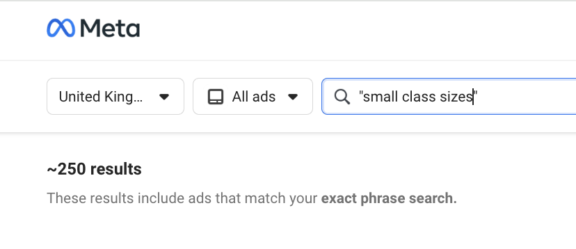
That’s not a dig, it’s a pattern. We’ve analysed over 100 school ads running right now in the UK, and most sound eerily similar. Same phrases. Same format. Same promises.
So we built a simple test, just a mirror. A moment of reflection. If you passed your ad in the wild, would you know it was The Wykeham Collegiate? Would a parent?
The Wykeham Collegiate in the Wild
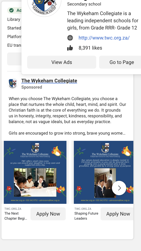
This is your current Meta ad. Let’s look at it through a parent’s eyes.
What’s Working
✅Clear positioning: The Christian foundation is front and centre. That honesty will resonate with families seeking a values-led education.
✅Tone of care: The language is gentle and nurturing—perfect for parents of younger girls looking for a safe, affirming environment.
✅Strong moral grounding: ‘Guided by a strong sense of purpose’ is a brilliant line—it just needs the right build-up to land with impact.
What’s Getting Lost:
🔁 Overused phrasing: ‘Small class sizes’ and ‘whole child’ language is everywhere. What specifically does this look like at TWC? Where’s the story or example that brings it to life?
❌No strong headline: The copy dives straight into ethos without a sharp, scroll-stopping entry point. It needs a hook that promises transformation, not just reassurance.
Without being too cringy - this causes something called paradox of choice. When every option looks the same, people don’t feel empowered. They feel overwhelmed. So they scroll past, not because they didn’t like what they saw, but because nothing stood out. If you're not subverting the pattern, you’re at risk of getting skipped over.


