Hi TBC,
There’s something charmingly individual about your visuals: a curious child with a magnifying glass, a stately building, and paddleboarding students in the countryside. There’s real potential to communicate a school that’s intimate, outdoorsy, and academically nurturing.
But here’s the test…
Imagine a parent scrolling at speed — phone in one hand, school tabs open in the other, head full of deadlines, diaries, and dinner plans. Would they see this ad and know it was St John’s? Would they get a sense of what only you offer? Or would it blur into the same reassuring-but-generic noise we’ve seen from dozens of schools?
To a parent scrolling Facebook with a half-eaten sandwich in one hand and school search tabs open in the other, your ad might look... like everyone else’s.
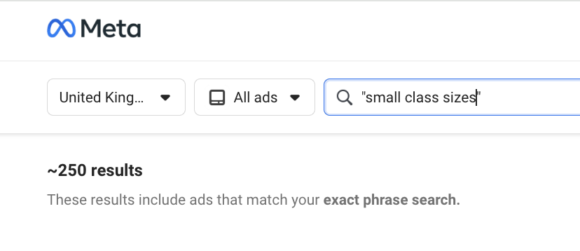
That’s not a dig, it’s a pattern. We’ve analysed over 100 school ads running right now in the UK, and most sound eerily similar. Same phrases. Same format. Same promises.
So we built a simple test, just a mirror. A moment of reflection. If you passed your ad in the wild, would you know it was Stoke College? Would a parent?


Stoke College Suffolk in the Wild
This is your current Meta ad. Let’s look at it through a parent’s eyes.
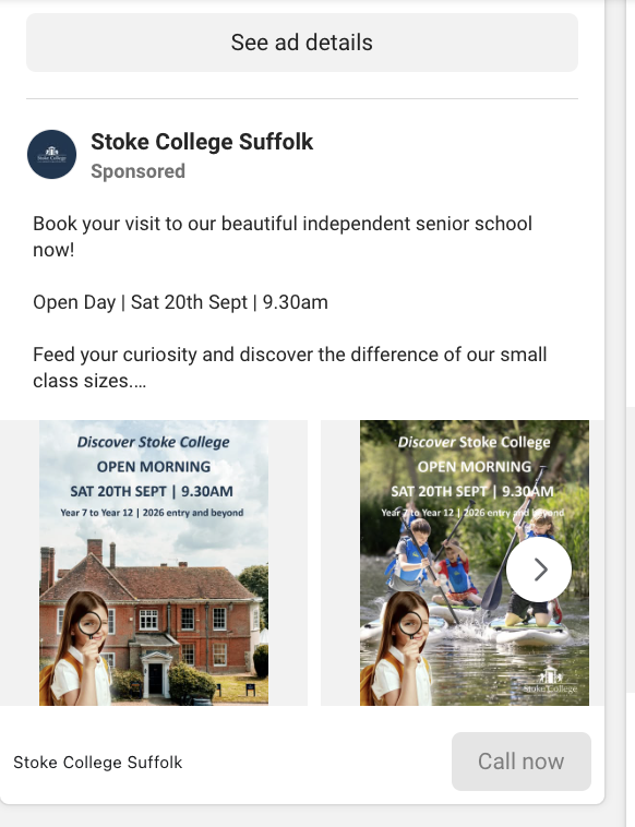
What’s Working
✅Visual consistency: The child with the magnifying glass across slides is an arresting visual hook—quirky and memorable.
✅Clear event info: The date, time, and year groups are prominent. No confusion about what’s being advertised.
✅Visual potential: The hero image of students climbing on Dartmoor hints at the unique setting. It’s on-brand.
What’s Getting Lost:
🔁 Missed storytelling opportunity: That magnifying glass is doing more emotional heavy lifting than the copy. Where’s the context behind it? Who is this child? What are they discovering?
❌“Small class sizes” is sector wallpaper: Every school says it. Few explain what it actually means. Right now, it sounds like a tick-box rather than a lived experience. What does it unlock at Stoke? Deeper discussion? Teachers who really know your child? More stretch, more support? Give it shape.
Without being too cringy - this causes something called paradox of choice. When every option looks the same, people don’t feel empowered. They feel overwhelmed. So they scroll past, not because they didn’t like what they saw, but because nothing stood out. If you're not subverting the pattern, you’re at risk of getting skipped over.