Hi John,
You’ve got a big opportunity: to showcase how LVS nurtures talent across academics, the arts, sport and more. The chance to join a thriving, all-through school with impressive facilities, values-led education, and a place where children grow up happy and successful.
But here’s the test…
Imagine a parent scrolling at speed — phone in one hand, school tabs open in the other, head full of deadlines, diaries, and dinner plans. Would they see this ad and know it was St John’s? Would they get a sense of what only you offer? Or would it blur into the same reassuring-but-generic noise we’ve seen from dozens of schools?
To a parent scrolling Facebook with a half-eaten sandwich in one hand and school search tabs open in the other, your ad might look... like everyone else’s.
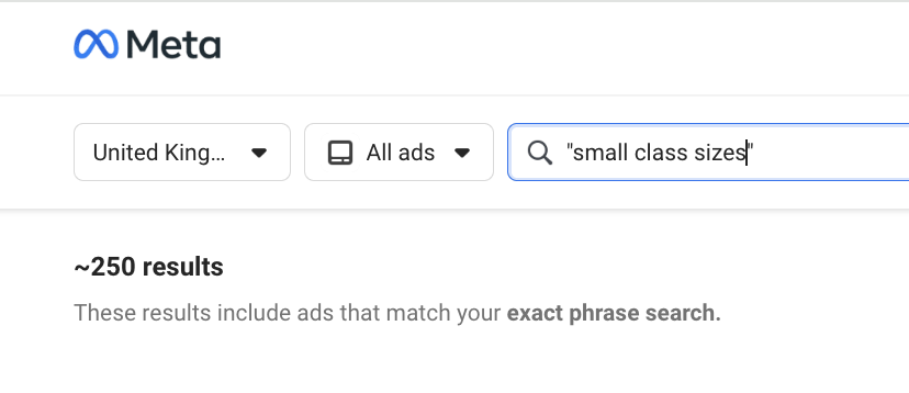
That’s not a dig, it’s a pattern. We’ve analysed over 100 school ads running right now in the UK, and most sound eerily similar. Same phrases. Same format. Same promises.
So we built a simple test, just a mirror. A moment of reflection. If you passed your ad in the wild, would you know it was LVS Ascot? Would a parent?


LVS Ascot in the Wild
This is your current Meta ad. Let’s look at it through a parent’s eyes.

What’s Working
✅Clear intent: The scholarship message is unmissable. The year groups are covered. The deadline is front and centre. All the information is there.
✅Aerial image gives a sense of place: The overhead campus shot does offer a glimpse of scale and environment—bright, open, well-resourced.
✅All-through clarity: Subtly referencing Infant to Sixth Form shows this is a full journey, which could be compelling for families looking for long-term continuity.
What’s Getting Lost:
🔁 Visual doesn't match message: The aerial image, while high quality, doesn’t reflect the pupil journey or excellence in the scholarship categories. It’s property, not purpose.
❌No sense of brand: This could be any school in the country offering scholarships. LVS doesn’t come through. There’s no identity, no values, no human tone of voice.
Without being too cringy - this causes something called paradox of choice. When every option looks the same, people don’t feel empowered. They feel overwhelmed. So they scroll past, not because they didn’t like what they saw, but because nothing stood out. If you're not subverting the pattern, you’re at risk of getting skipped over.