Hi Rachell,
Channing School has a unique kind of confidence. It doesn’t shout. It doesn’t follow. It thinks. You’ve built a school where intellect, kindness, and individuality sit comfortably alongside ambition. That “10% braver” mindset? That’s the kind of language parents remember.
But here’s the test…
Imagine a parent scrolling at speed — phone in one hand, school tabs open in the other, head full of deadlines, diaries, and dinner plans. This is an ad that parents like — but will they remember it tomorrow? Would they get a sense of what only you offer? Or would it blur into the same reassuring-but-generic noise we’ve seen from dozens of schools? Because when messaging blends into universally positive language, it becomes emotionally agreeable… but not commercially distinctive.
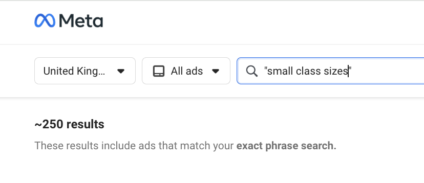
That’s not a dig, it’s a pattern. We’ve analysed over 100 school ads running right now in the UK, and most sound eerily similar. Same phrases. Same format. Same promises.
So we built a simple test, just a mirror. A moment of reflection. If you passed your ad in the wild, would you know it was Channing? Would a parent?


Channing School in the Wild
These are your current Meta ads. Let’s look at them through a parent’s eyes.

What’s Working
✅The ‘10% braver’ line is excellent: It’s memorable, distinctive, and emotionally resonant. Easily the strongest hook in the whole ad.
✅Values-led messaging: Referencing Unitarian values and purposeful learning speaks to discerning parents who value ethical grounding.
✅Tone aligns with the school: There’s a calm intelligence in the language that feels like Channing. It doesn’t feel shouty or try-hard.
What’s Getting Lost:
❌Too much tell, not enough show: Lines like “exceptional co-curriculars” and “meaningful partnerships” are too vague to stick. What are they? Why do they matter?
🗣️It’s not leveraging your best asset—your tone of voice: The school’s brand has a distinct, thoughtful voice. This copy flattens it into brochure-speak. With some rhythm and restraint, it could be brilliant.
Without being too cringy - this causes something called paradox of choice. When every option looks the same, people don’t feel empowered. They feel overwhelmed. So they scroll past, not because they didn’t like what they saw, but because nothing stood out. If you're not subverting the pattern, you’re at risk of getting skipped over.