Hi Karen,
Blackheath High is clearly proud of its girls, and it should be. You’ve got confident young voices, ambitious dreams, and a track record of nurturing self-belief in an academic environment that doesn’t feel cookie-cutter. The promise is there: “Where girls boldly go.”
But here’s the test…
Imagine a parent scrolling at speed — phone in one hand, school tabs open in the other, head full of deadlines, diaries, and dinner plans. This is an ad that parents like — but will they remember it tomorrow? Would they get a sense of what only you offer? Or would it blur into the same reassuring-but-generic noise we’ve seen from dozens of schools? Because when messaging blends into universally positive language, it becomes emotionally agreeable… but not commercially distinctive.
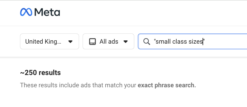
That’s not a dig, it’s a pattern. We’ve analysed over 100 school ads running right now in the UK, and most sound eerily similar. Same phrases. Same format. Same promises.
So we built a simple test, just a mirror. A moment of reflection. If you passed your ad in the wild, would you know it was Blackheath? Would a parent?


Blackheath High School in the Wild
These are your current Meta ads. Let’s look at them through a parent’s eyes.

What’s Working
✅Student-led storytelling is a great direction: “My stories will change the world” and “I’ll perform in front of 5,000 people one day” are gold. They’re bold, empowering and memorable.
✅Thematic structure works: Dividing the campaign into Nursery, Junior and Senior helps make each message feel age-specific and relevant, while the CTA is consistently clear.
✅Club and co-curricular offering is strong: Referencing 80+ clubs (from martial arts to Mandarin) conveys choice and breadth in a concrete, parent-relevant way.
What’s Getting Lost:
❌Inconsistent tone: The handwritten-style student aspirations are brilliant, but they clash with generic lines like “academically ambitious, tailor-made environment.” It dulls the impact.
🗣️Lack of emotional escalation: There’s no crescendo. The quotes and stats are good, but they don’t build into a powerful reason to act. The user journey stops at “that’s nice” rather than “I need to find out more.”
Without being too cringy - this causes something called paradox of choice. When every option looks the same, people don’t feel empowered. They feel overwhelmed. So they scroll past, not because they didn’t like what they saw, but because nothing stood out. If you're not subverting the pattern, you’re at risk of getting skipped over.